Power users want to directly interface with the data structure of the app
I’ve noticed a really interesting trend lately in apps built for power usage… When the user starts out, they have a GUI (Graphical User Interface) that helps them learn how to do things. As User skill level increases over time, they can actually disable elements of the GUI, decreasing the clutter on the screen that they no longer need as a memory aid for how to do X or Y.
Take a look at how Figma shows you all of these buttons you can click that would modify your selection. This helps the new user discover what is possible!

Eventually, Figma users will learn keyboard shortcuts. At this point, they can press a shortcut (command+period on Mac) that will hide most of the UI. Now they are just interacting directly with Figma’s infinite canvas data structure. Advanced users speed up and enter a flow state with total immersion. Manipulating a file feels as intuitive as reaching to grab something. It’s just like movement.

I recently saw a post on LinkedIn where someone shared a five page PDF filled with keyboard shortcuts in Excel. Can you imagine how rewarding your mastery would feel if you learned all of them, and were able to interact with just a spreadsheet? No BS that clogs your screen, just rows and columns? You know how the data structure works and how to move… wouldn’t those training wheels just feel like clutter?

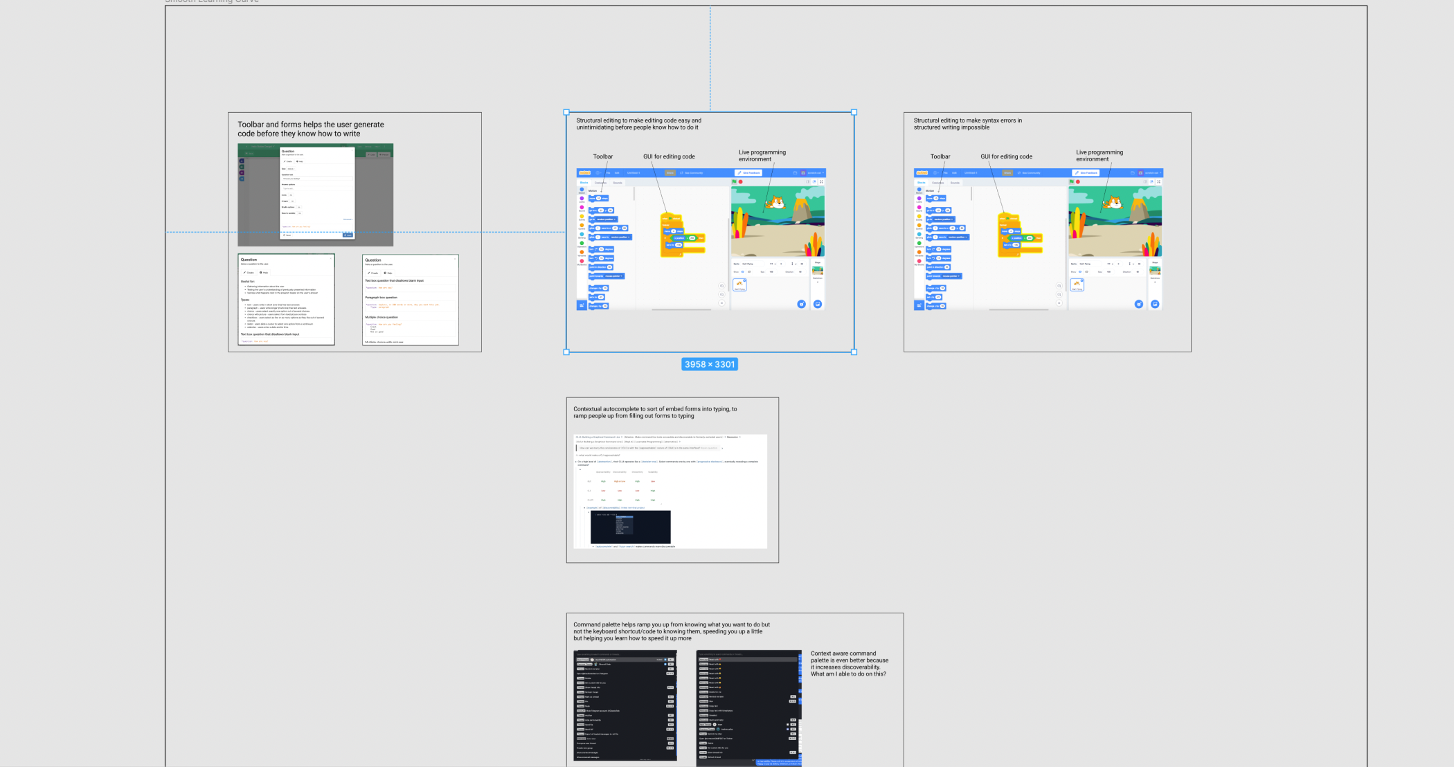
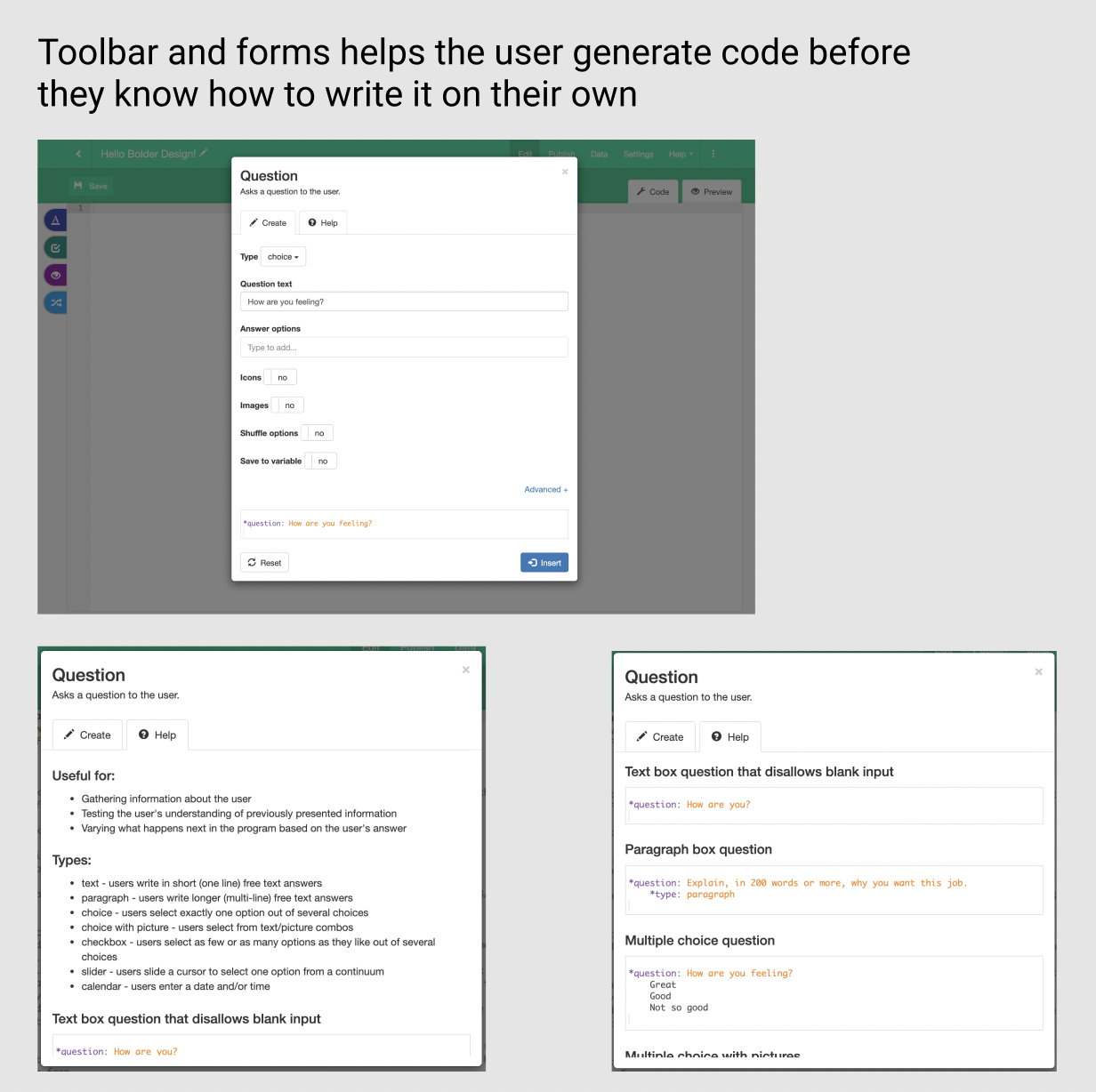
In GuidedTrack, you start out using the toolbar and filling out forms that generate code for you based on your inputs. Eventually, you’re just writing the code yourself.

When you’re at the point where you’re just writing code instead of using the toolbar, you aren’t slowed down by having to click through a bunch of different screens. The user actually gets faster, as they’re able to produce code as quickly as they can type. We’re using the GUI as training wheels for more efficient workflows, whereas GUI first applications like Tripetto won’t get much quicker after you learn how to use it.
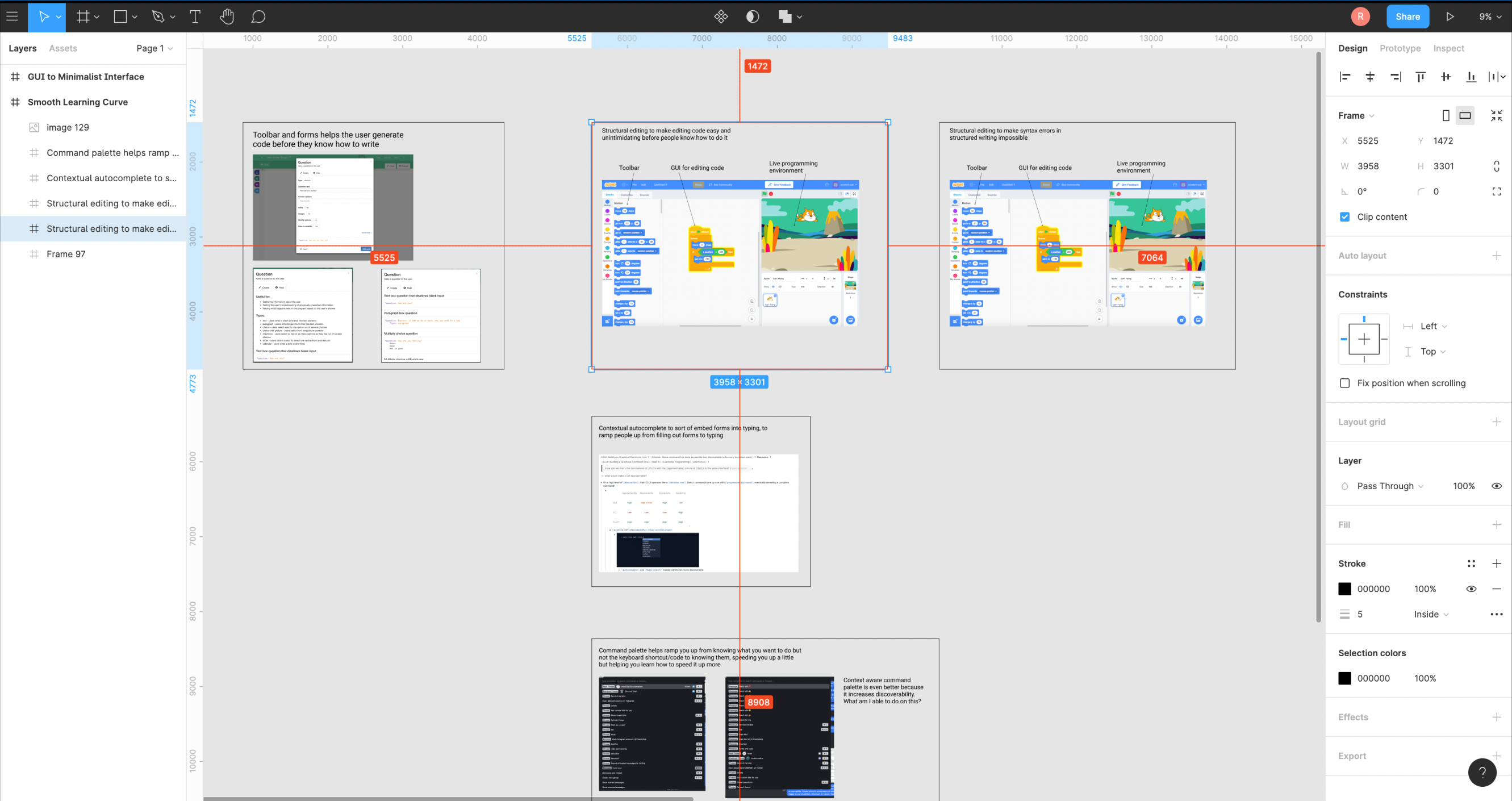
This is a Figma file, so you can move around it with normal zoom-pan controls (pinch or scroll your mouse to zoom, click-drag to pan)
I’ll need to think about this more, but in general the trend seems to go as following: the GUI provides training wheels to understand the data structure of the application, and power users want to directly interface with the data structure of the app, with as much information density as possible. The next question becomes: How might we Provide a smooth learning curve from new user to power user?
As Joel Spolsky says, Horizontal products are just fancy data structures. How might we give users as much power over that structure as possible?