Programmable text interfaces are the future
Authored By:: Rob Haisfield
# Programmable text interfaces are the future, not GUIs
People who don’t code are accustomed to interacting with apps with Graphical User Interfaces (GUI) 1. In order to give instructions to a GUI app, users need to click on buttons/menu items, click-and-drag blocks, and write in text boxes. GUIs are the dominant interaction design paradigm for non-coders 2.
Without code, people need to be comfortable with whatever pre-existing features they can find, and if they want something custom, they will need to hire a coder or use a graphical no-code tool that will ultimately require them to use the same coding concepts.
Coders will open a text file with an Integrated Development Environment (IDE) 3. Their IDE will provide helpful features (graphical or textual) to debug, refactor, and generally support writing more functional code. Coders give software instructions by writing in text what they want. Generally, code is flexible enough that they can make it do anything they want.
While working on the onboarding for GuidedTrack 4, I began to think… What if people could interact with apps like coders interact with their programs? What is the difference between clicking a button to call a function and writing code to call a function? In the future of text, I foresee programmable text interfaces with custom IDEs replacing graphical applications.
GuidedTrack 5 is a simple low-code application that allows you to make surveys, experiments, web applications, online courses, signup forms, and more. While the use cases are broad, here I will primarily focus on the form builder side of it for simplicity. As one of my projects with Spark Wave 6, GuidedTrack is the best example I know of a textual interface, so I’ll dive into it and extract takeaways as I go.
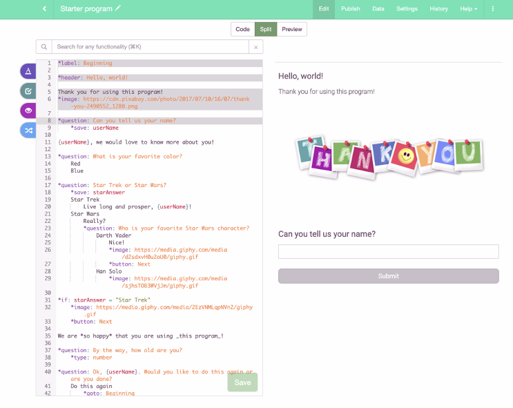
The keywords are direct and domain-specific. If you were to describe a survey in an email that you send to a collaborator, how would you do it? That’s not going to be far off from how it looks in GuidedTrack. This makes it feel like a textual interface for an app people are already familiar with. Users write their instructions with text at the level of abstraction they care about.
Straightforward and direct language design is crucial. This quote from A Small Matter of Programming 7 stuck out to me: “A mathematician, in a broad sense, already knows Mathematica.” Wolfram Mathematica formally encodes pre-existing mental models / notation into a syntax that can be used for computing.
Each line represents a function (marked by the keyword at the beginning of the line), and relationships are conveyed through indentation. In order to add a caption to an *image, you indent a caption under the *image. In order to ask a follow-up *question, you indent the follow-up underneath specific answers, which are indented under the question. Saving responses to use for later is also done through indentation. The syntax is simple.
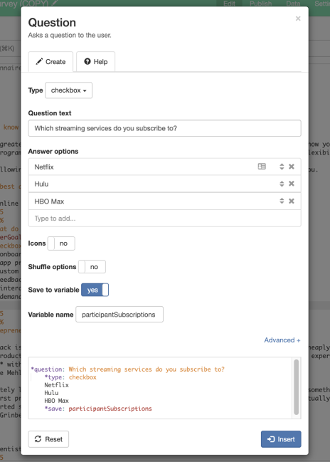
In user research, we found that non-coders often believe that in order to write code, they need to spend significant time reading documentation upfront. However, in GuidedTrack we have a toolbar filled with forms that enable you to write code through a graphical interface. All the user needs to do is fill in the blanks, toggle options on or off, and select options from menus. The toolbar enables users to learn as they go and write code before they know how. This is more or less equivalent to the graphical interfaces people are used to in Google Forms, but the difference is that once you get used to it you can just type.
For example, in this image, we see a form for writing a question. This multiselect checkbox type question will save the answers to a variable labeled participantSubscriptions. Later, these saved answers can be referenced in a conditional (e.g. “if Netflix in participantSubscriptions, ask this question”) or a loop (e.g. “Ask the same followup question about each of the answers they selected”). There are forms for those as well!
Loops and conditionals fall under the broader category of “control flow.” By default, content (text, questions, charts, images, etc.) are read as instructions, flowing top to bottom. If that feels restrictive, loops and conditionals can declare other rules. A new user can learn how to replicate Google Forms’ functionality in 10-15 minutes without requiring control flow. However, upon learning to use control flow, they will not want to return to the limitations of GUI alternatives.
Simply adding variables and control flow to a form builder gives people the ability to create their own functionality. Users don’t need to wait for developers to implement a specific feature.
Our competitors will advertise that they can do calculations as though that is a noteworthy feature! These calculations are used to score users’ responses (in a quiz, for example). In GuidedTrack, calculations are emergent from the way saved variables work. In the case of a quiz, it would look something like: totalScore = totalScore + lastAnswerScore after each question.
Another example: an alternative form builder, Tripetto, is able to take the above question and ask how long the respondent was subscribed to each of the streaming services. The developers of Tripetto needed to specifically design that feature. It takes 20+ clicks (besides typing) and ~3 minutes to do it. That will never get faster.
GuidedTrack doesn’t have specific functionality for this. We don’t have a long set of steps. However, control flow makes it possible in 15 lines of code. Most of that code is the same text Tripetto users would have to write anyway. Although it is more advanced than what beginners will need or know how to do 8, many serious knowledge workers, like course creators or PhD researchers, will need a tool that can scale with their changing goals over the course of a whole career. GuidedTrack, as programmable text, can handle the increasing demands of users with changing goals 9. The feedback loops 10 built into the design of its editor enable users to increase their skills as they go 11.
Textual interfaces are as fast as typing. If writing a question, its answers, and the loop with the follow-up question is 60 words, then it will take you 1-1.5 minutes. When the syntax feels natural, creating feels like writing. Most people who use computers know how to type, and have had to use Google or Word documents. The keyboard shortcuts people are familiar with (command-a to select all, command-c to copy, command-v to paste, etc.) all work in a text editor because text editors have worked this all out already! If you try to copy/paste multiple questions at a time in a graphical application like Typeform, you can’t. If you try to undo an accidental change with command-z, you can’t. Graphical applications have to specifically build keyboard shortcuts that text editors can do by default.
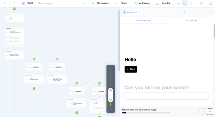
Oftentimes, writing and reading is simply more pleasant than dragging and dropping. Text is incredibly information dense. Look at the difference between the same survey in GuidedTrack vs. Tripetto. With Tripetto, you would need a massive screen to work with a long survey!
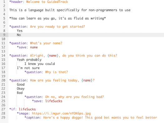
A key problem that confronts domain specific languages attempting to replace standard graphical applications is that they can be intimidating to non-coders. People who don’t know how to code will look at anything that looks remotely like code as something that is “for coders.” They assume that programming anything requires years of learning and prior experience. For the most part, they are not wrong. The sort of work you hire developers to do often does require specific knowledge.
However, we are not trying to be a general purpose programming language like Python or JavaScript that can write anything. We’re just trying to replace a creation-oriented application with programmable text and a custom IDE. If you have to make a programming language that only makes surveys and experiments, it does not need to be complex. Let’s say that again more broadly: If you have to make a programming language that only does ______, it does not need to be complex.
Non-coders don’t need to think about deployment or backend boilerplate. In order to send the program to someone, they only need to send a link. The program doesn’t require any code to save all of the responses to a spreadsheet, because why should someone trying to write research have to think of that? All of this complexity is abstracted away for our end users.
User research clearly demonstrated that novice users felt more comfortable when they could look at code and predict what it would do. Obviously, that meant we needed users to see simple programs upfront. Unfortunately, we also learned that too many code comments to explain the code actually made code scarier! It is as though that sent the signal that there was more to explain.
Our solution here was to implement a “split view.” In the split view, we show users what code (on the left) is actively producing what is displayed in the preview (on the right). Originally, you would need to read code first and then view the preview. With the split view, instead of requiring users to read code and then preview it, they can do both at the same time. This tightened the feedback loop dramatically and enabled us to remove most code comments as they became unnecessary 12. Further usability tests were like night and day - we were far less likely to hear the “I’m not a coder” protest. Legibility is key, and the simple design of the language is complemented by the IDE’s design.
In HCI research, the split view is sort of like a live programming environment, in Bret Victor’s terms 13. We still have substantial work here to improve the experience, but for more, Sketch-n-Sketch 14 and their research represents the state of the art.
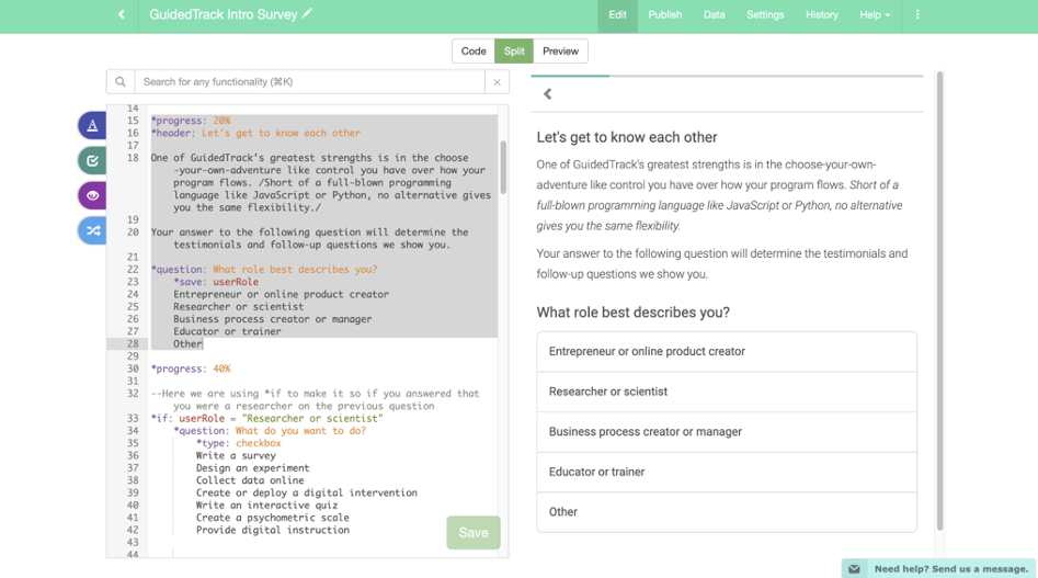
To sum up, here is what we have so far that can be generalized beyond GuidedTrack:
● The familiarity and speed of text
● The user delivers instructions through text instead of buttons
● Powerful programming concepts like variables and control flows to unlock customized use cases
● Boilerplate code is abstracted away so the user can focus on creation within their domain
● Strong cognitive scaffolding (via graphics or other means) to make sure that it is approachable and people learn as they go
# What other graphical applications could have a programmable text as an interface?
GuidedTrack is awesome, but the point of this piece is to show a new kind of application design. There is no shortage of possibilities here. In no particular order:
- Task managers and schedules. What better way to express that starting one task depends on finishing another than writing a conditional if-then statement? Isn’t a repeating event just an event on a loop until it’s canceled? Isn’t it nice to be able to write your todos as though they were on a notepad as opposed to navigating through a GUI? With a text editor, it would be easy to copy/paste a selection of tasks to move them into another project. With conditionals, you could create an event that only occurs if half the invitees RSVP yes. This would be more about primitive design than feature design.
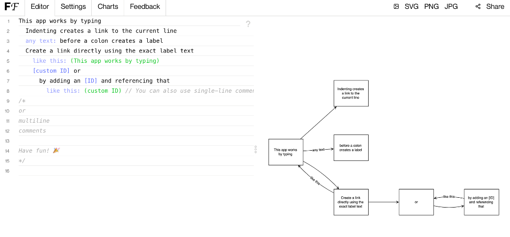
- Diagrams and flowcharts. See Flowchart.fun 15 to see how indentation and notation can make flowcharts easy. In order to be more aligned with how I’m looking at it, it would require some level of programmatic control on top of the boxes, lines, and sets of boxes and lines.
- Configuration files. With most graphical applications, if I’m using them on multiple computers or across multiple accounts, I will need to manually change the settings each time. If settings were run through text, it’s easy to transport through copy/paste.
- Personal finance. Many people do this with custom spreadsheets 16. You could also do this with a domain-specific language, it might look something like the image from Andrew Blinn 17 or the pseudocode below. Notice how specific the functions are - there’s no boilerplate for users, so they can focus on providing instructions.
| |
- Discourse/knowledge graph database entry, retrieval, and visualization. This is one subject of my research with The Graph 18.
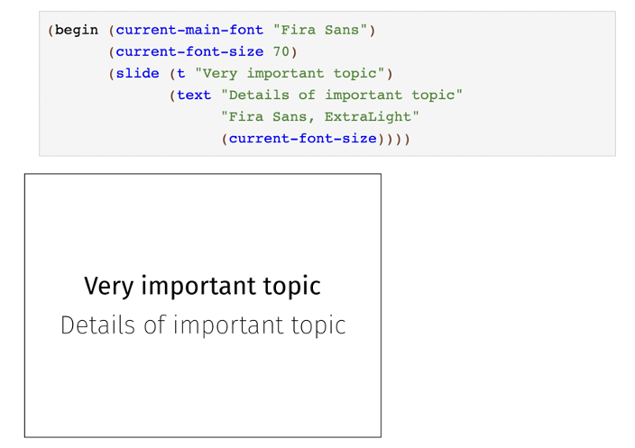
- Slideshows. The Racket lang Slides 19 demonstrate this. With programmability, an editor could change the background image and font on multiple slides at once, or turn it into a choose your own adventure, HyperCard style 20.
# The future is programmable text, not graphical applications
Most people are accustomed to graphical interfaces. Those are fine for basic use cases, but as user goals become more advanced, graphics alone will not be enough. This is where programmable text comes in.
Text is fast, as fast as we can type. Text can express complicated control flow concepts and abstract repetitive processes to create functionality that the app’s designer would never conceive of on their own. Thus, it’s more about the design of primitives than features. Our job as designers is to make sure people can predict the outcome of their code through communicative feedback loops 21 and examples they can build on. Clear documentation and graphical scaffolding can help them begin. In order to create a powerful application with a low floor, wide walls, and high ceiling 22, it is important to think about how people can learn as they go through. Graphics can help people get started, but text will take applications and their users to the next level. If the language is simple, creation will feel like writing.
References
Wikimedia Foundation. (2021, September 26). Graphical user interface. Wikipedia. Retrieved from https://en.wikipedia.org/wiki/Graphical_user_interface. ↩︎
Angert, T., & Elkammash, M. (2020, March 5). CLUI: Building a graphical command line. Replit Blog. Retrieved from https://blog.replit.com/clui. ↩︎
Wikimedia Foundation. (2021, September 29). Integrated development environment. Wikipedia. Retrieved from https://en.wikipedia.org/wiki/Integrated_development_environment#:~:text=An%20integrated%20development%20environment%20(IDE,automation%20tools%20and%20a%20debugger. ↩︎
Haisfield, R. (2020). GuidedTrack. Rob’s Hypertext Notebook. Retrieved from https://robhaisfield.com/notes/guidedtrack. ↩︎
GuidedTrack. (2020). Retrieved from https://www.guidedtrack.com/. ↩︎
We create software companies to solve important problems. Spark Wave. (2021). Retrieved from https://www.sparkwave.tech/. ↩︎
Nardi, B. (1995) A Small Matter of Programming: Perspectives on End User Computing. Retrieved from https://scattered-thoughts.net/blog/2016/06/17/notes-on-a-small-matter-of-programming-perspectives-on-end-user-computing/ ↩︎
Haisfield, R. (2020). New users do not yet have the vocabulary to understand the app. Rob’s Hypertext Notebook. Retrieved from https://robhaisfield.com/notes/new-users-do-not-yet-have-the-vocabulary-to-understand-the-app. ↩︎
Haisfield, R. (2020). User goals change over time. Rob’s Hypertext Notebook. Retrieved from https://robhaisfield.com/notes/user-goals-change-over-time. ↩︎
Haisfield, R. (2020). Feedback loops are a more efficient method of communication. Rob’s Hypertext Notebook. Retrieved from https://robhaisfield.com/notes/feedback-loops-are-a-more-efficient-method-of-communication. ↩︎
Haisfield, R. (2020). User skill level increases over time. Rob’s Hypertext Notebook. Retrieved from https://robhaisfield.com/notes/user-skill-level-increases-over-time. ↩︎
Haisfield, R. (2020). Feedback loops are a more efficient method of communication. Rob’s Hypertext Notebook. Retrieved from https://robhaisfield.com/notes/feedback-loops-are-a-more-efficient-method-of-communication. ↩︎
Victor, B. (2012, September). Learnable Programming - Designing a programming system for understanding programs. Learnable Programming. Retrieved from http://worrydream.com/LearnableProgramming/. ↩︎
Ravi Chugh. (2021). Fun, Funky, Functional: The Pursuit of Better User Interfaces for Programming. Retrieved from https://www.youtube.com/watch?v=1gGd7pKSpRM. ↩︎
flowchart.fun. Flowchart Fun - Online text to flowchart creator. (2021). Retrieved from https://flowchart.fun/. ↩︎
Kryptik. (2021). Portfolio tracker by Kryptik. Portfolio Tracking Template. Retrieved from https://docs.google.com/spreadsheets/d/1qYLOAjzaIIcFLFw_j-P4yH0oOhYdy-CcmBItEc6--50/edit#gid=464576501. ↩︎
Blinn, A. (2021, September 16). Twitter Reply re: Programmable Transactions. Twitter. Retrieved from https://twitter.com/disconcision/status/1438302534649667590. ↩︎
Haisfield, R. (2021, July 13). Twitter Announcement - Research with The Graph. Twitter. Retrieved from https://twitter.com/RobertHaisfield/status/1415041842064756737?s=20. ↩︎
Takikawa, A. (2018, March 31). Making the Most of #lang Slideshow. Asumu. Retrieved from https://www.asumu.xyz/blog/2018/03/31/making-the-most-of-lang-slideshow/. ↩︎
Wikimedia Foundation. (2021, September 27). HyperCard. Wikipedia. Retrieved from https://en.wikipedia.org/wiki/HyperCard#:~:text=HyperCard%20is%20a%20software%20application,flexible%2C%20user%2Dmodifiable%20interface. ↩︎
Haisfield, R. (2020). Continuous onboarding. Rob’s Hypertext Notebook. Retrieved from https://robhaisfield.com/notes/continuous-onboarding. ↩︎
Brander, G. (2021). Low floor, wide walls, high ceiling. Gordon Brander. Retrieved from https://gordonbrander.com/pattern/low-floor-wide-walls-high-ceiling/. ↩︎