Organizing Knowledge with multi-level content
# Organizing Knowledge with multi-level content:
# Making knowledge easier to understand, remember, and communicate
# Notes:
This paper discusses how to best communicate multi-level content. Multi-level content refers to the idea that there are multiple levels at which you can describe a concept. For example, a paper’s abstract may be understood as a high level overview of the paper’s contents. For some, the abstract might be enough, but for others, they will need to read the paper for low level details.
The author provides The Cognitive Bias Codex as an example of multi-level content communication. Going from the outer rings to the inner rings, there are four categories that describe 20 subcategories which describe 180 specific cognitive biases. This allows readers to gain a high level conceptual overview and then narrow in on the specific subjects they care about.
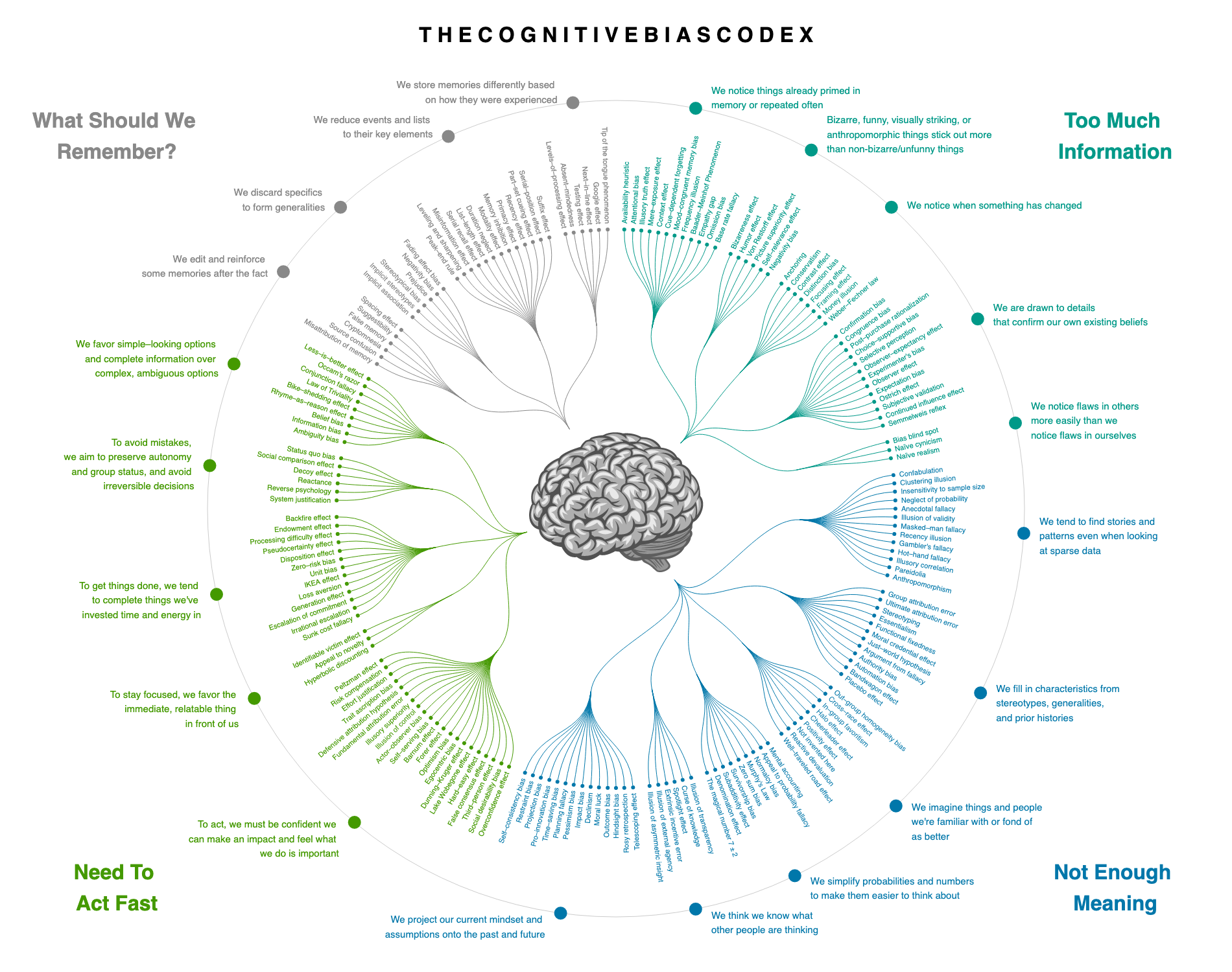
The paper refers to “the problem of multiple knowledge levels.” Essentially, knowledge has a hierarchical structure, and if high level overviews or low level details are missing, it becomes harder to understand. Additionally, if high level overviews are visually undifferentiated from low level details, then the reader might waste their time trying to understand the domain in a more difficult way.
In some ways, Francis Miller is attempting to solve a problem of Search Behavior in an exploratory search setting. Essentially, how can people find what they are looking for, even when they do not know how to describe what they are looking for? Starting with broad questions and progressively drilling down into specific domains may be an effective search strategy. After all, An exploratory search system should help the reader cumulatively gain information.
Writing in hypertext attempts to solve the same problem. Whenever the reader is unclear about a concept, they can click on the hyperlink, read about it, and then bring their new knowledge back to the note that they were originally reading. When the hypertext links have descriptive titles, they provide an “information scent” that informs the reader whether it will be worthwhile to follow that link’s path.
However, hypertext differs from what Miller proposes insofar as it describes a flat information architecture. In hypertext, you can start on any page and explore outwards. Compared to Miller’s abstract to specific search strategy, however, it may be inefficient.
One solution to the problem of multi-level content is apparent in the structure of the paper. First there is a summary of the paper as a whole, followed by a summary of each of the four parts, followed by each of the four parts. While the paper itself is more than 90 pages, the expectation is that people will only need to read the subset of those pages necessary to satisfy their interests.
Another idea present in the paper is a Zoomable User Interface. While the term was not explicitly mentioned, the author alluded to the concept. Imagine a digital map. When you zoom in, you see the names of specific streets and stores, but when you zoom out, those fade away and are replaced with the names of towns and cities. Now imagine a discourse graph where you can zoom in or out to go from increased detail to broader abstractions.
This implies the necessity of Summarization as a primitive.
A key requirement to participating in a discourse graph for a specific domain is knowing the vocabulary used in that graph. ZUIs that support abstract to specific search strategies can facilitate people learning the vocabulary they need.
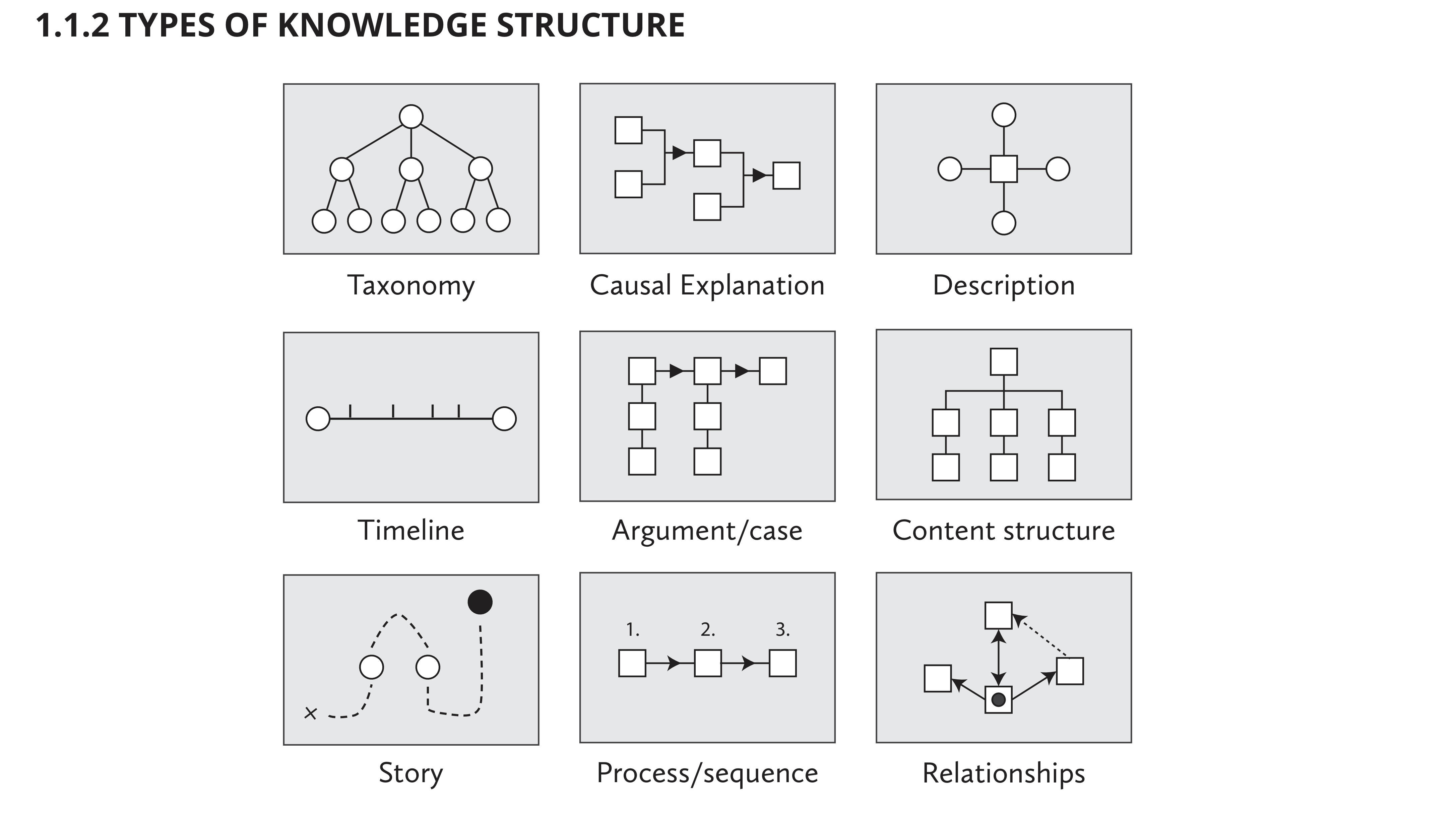
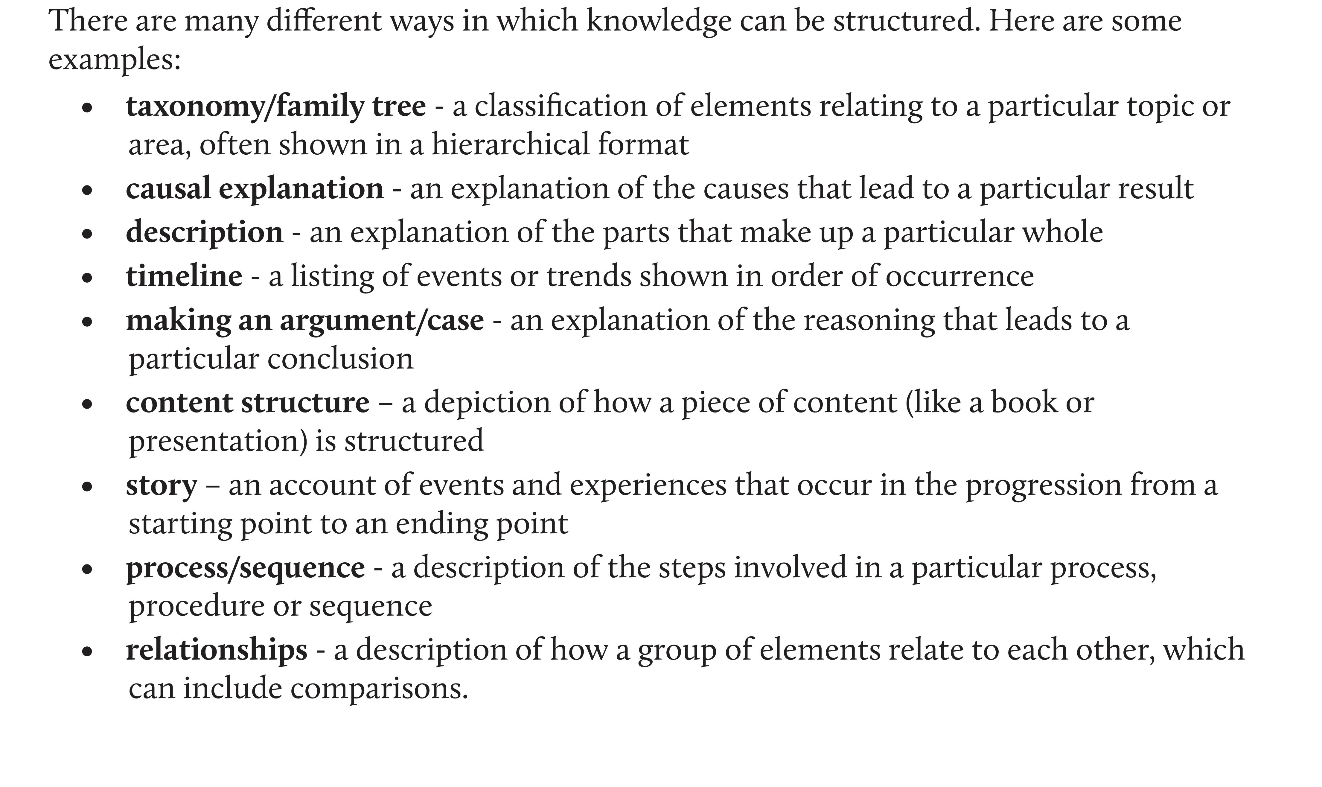
The paper also shows multiple types of knowledge structure which may be taken into consideration to answer What is the data structure of a graph built to facilitate decentralized knowledge synthesis.
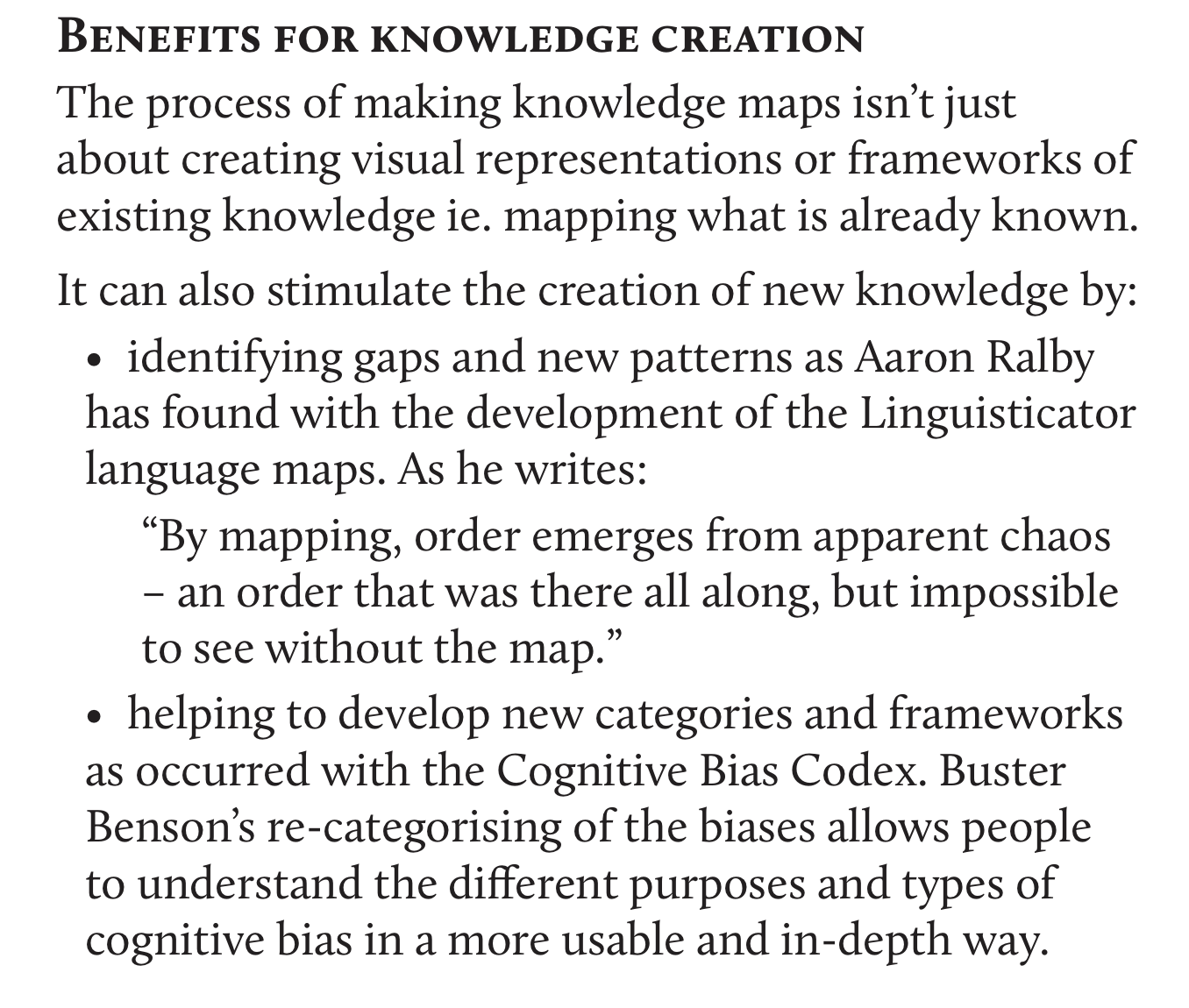
Additionally, Miller makes the argument that the very act of making knowledge maps that communicate the multiple-level content is rewarding and fruitful. When considering the question What are powerful interfaces for entering information into a discourse graph with the goal of promoting synthesis, we should bear this in mind. Map making is itself a primitive. Zooming It allows you to identify gaps and patterns that would otherwise remain undiscovered without a forcing function to lay out all of the information and its structure from top to bottom.
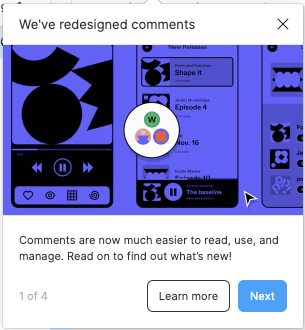
Figma now lets you zoom in and out on comment threads and clusters. Notice how I click on the middle right DR and that zooms into a cluster of 4 comment threads.
